Behind the Scenes: Data Edition
Introduction
As a lifelong cinephile, the dynamic landscape of the film industry has always fascinated me. In this age where technology and society are in constant flux, I found myself intrigued by how these elements have shaped the cinematic world over the last 25 years. This blog post is a culmination of that curiosity, exploring the intricate tapestry of the movie industry through the lens of data analytics. From the evolution of genre preferences to the changing faces both in front of and behind the cameras, I delve into how the film industry has adapted and evolved with the advancements in technology and shifts in social paradigms.
EDA
While completing this project, I had a number of questions that influenced where I started. Through this section I will take you through those questions and what visuals I generated that might help provide an answer.
Genre
1. How Have Genre Preferences Changed Over the Years?
Because I wanted to look at genre by year, I found that the most readable graph is a heatmap.
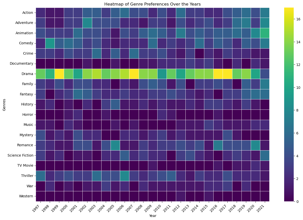
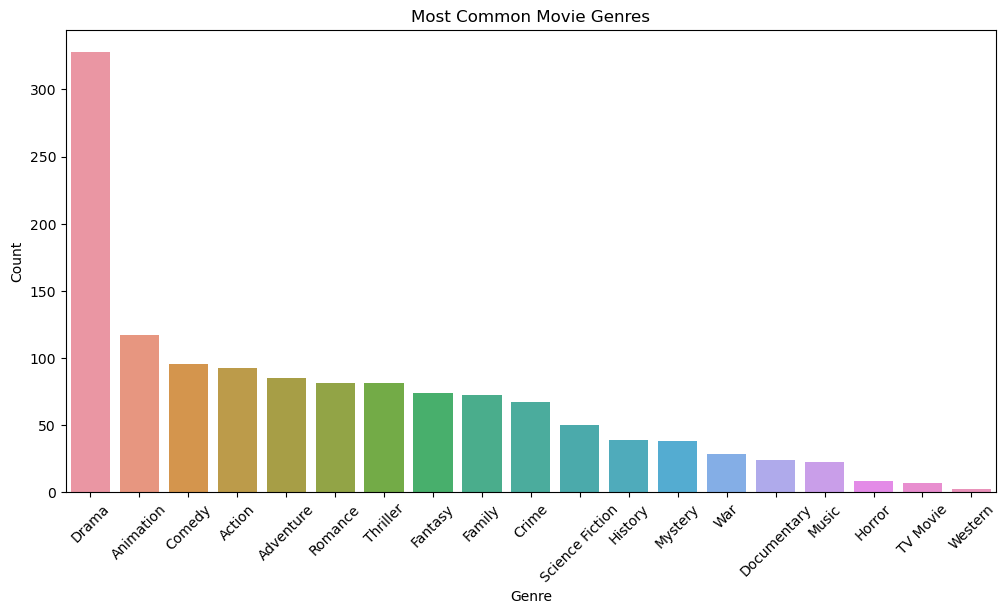
As you can see, drama dominates movie genre, with numbers almost always above 10-12 movies. This makes sense, because a drama seems like it could be the least affected by technological changes. We can also take a look at a bar graph of genres and see that drama drastically outnumbers the rest:
2. Do Top Directors Have Genre Preferences?
This question actually yielded some unexpected results. I’ve found that I associate a director with very specific genres without much wiggle room. For example, when I think of Christopher Nolan, I think action and action only. This graph suggests that’s not the case, with Nolan actually directing the most diverse array of films.
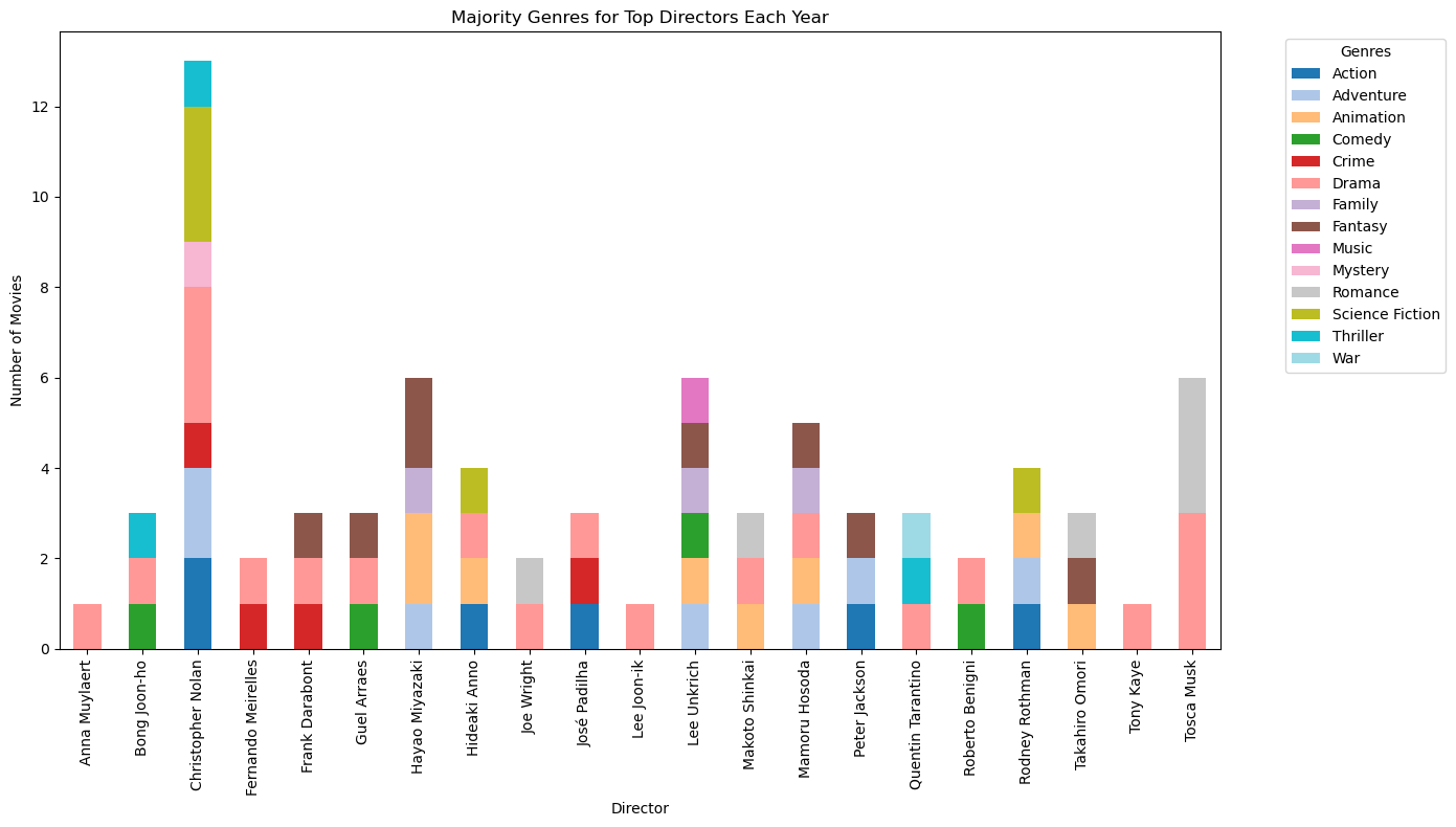
*I will note that I chose to omit Roman Polanski from this list despite the fact he is in the top 25 directors.
Finances
3. How Has Total Revenue Changed From 1997-2021?
This question was actually one of the first that came to mind after deciding on my project topic. I thought that revenue would be most affected by outside factors, such as socio-economic happenings in the world. This idea can be supported in the following graph:
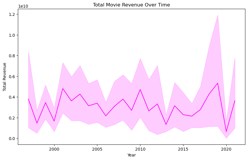
While a majoirty of this map ebbs and flows as expected, looking at years such as 2020, you can see that movie revenue was highly influenced by outsie factors, namely COVID-19. It’s also interesting to look at the are representing the years from 2015-2019, because there wasn’t as much growth in revenue as there was in previous periods. I would probably attribute this to the rise of streaming services, which started serving as a replacement for a movie theatre experience.
Along the same lines, I thought it would be interesting to look at the relationship between budget and revenue with a scatterplot:
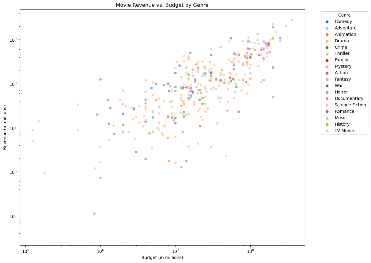
As expected, a film with a higher budget will get a higher rating.
4. Where Do Production Companies Fit In?
I also wanted to see where specific production companies fit in. Here, take a look at the number of movies and the revenue from those movies of each production company:
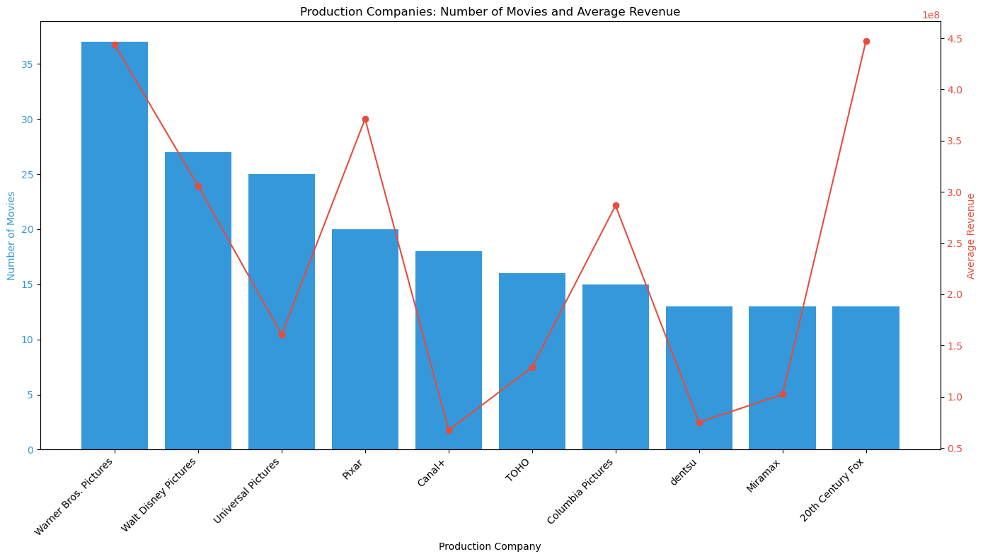
It’s interesting to look at production companies like Universal Pictures, Canal+, and 20th Cnetury Fox, whose number of movies and revenue have an inverse relationship.
Gender Diversity
The last thing that I wanted to look into was gender data. Unfortunately, the TMDb API doesn’t have extensive data on gender or age distributions of film casts and crews, but I still wanted to scratch the surface. Below, I plotted that diversity:
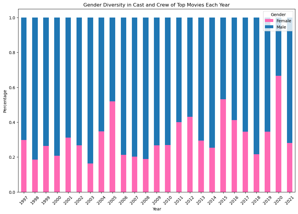
As you can see, the film industry is still heavily dominated by men. There is an interesting rise in female inclusion in 2005, and looking back to the genre heatmap suggests that this may be attributed to a higher number of romance movies made that year. I also noticed that from 2015-2018, there was a steady decline of female presence in the industry. I infer that this may be due to the slow rise of the ‘#MeToo’ movement, which could also be supposted by the largest drop being from 2017-2018 - it was October of 2017 that allegations against Harvey Weinstein were publicized. As for 2021, I truly do not know why the number of women decreased so significantly. I can only hope that the trend shifts to a positive direction.
Conclusion
In conclusion, this exploration into the evolving landscape of the film industry over the past 25 years has revealed compelling insights into genre trends, revenue patterns, and production dynamics. I personally found the simple scatterplot to be one of the more interesting graphics, specifically because of the outliers that didn’t quite fit the linearity of the majority of the plot. The data-driven journey underscores the profound impact of technological advancements and shifting social norms on cinema. Looking ahead, I aim to pivot my analysis towards the nuanced realm of gender and age demographics within Hollywood. This future focus promises to unearth deeper understandings of representation and equity in the industry, shedding light on the intersection of art, culture, and societal change.
If you would like to explore the data further, head to my streamlit app!